YouGov Crafting a meaningful value proposition and a vibrant new identity to drive growth
Bringing the richest and most complete understanding of consumers’ complex lives to life for a global audience.
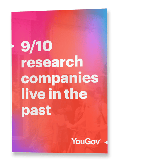
YouGov is an international research data and analytics group.
Their products and services help the world’s most recognized brands to shape, plan, activate and track better marketing activities.
YouGov’s main focus for growth is to open up new revenue streams through a mix of expanding into new markets and cross-selling to existing customers.
The challenge
Despite having strong brand recall in the UK due to their work in political polling, YouGov had two main challenges that hindered their growth objectives.
Strategically, sales teams often pitched product first. This meant that many customers only bought into a single product, as opposed to buying into YouGov as a whole, thereby limiting cross-selling opportunities.
In new territories they lacked brand awareness. They also struggled to communicate how YouGov were different in the marketplace and so were deemed as “just another market research agency”.
Visually, their brand was centred around “The Cube”, an internal phrase used to explain how YouGov collected data, but couldn’t explain why this was valuable to clients.
The strategy
To craft a meaningful value proposition and new visual identity.
Most market research panels rely on commissioned research or periodic surveys and questionnaires. However, these insights are already out-of-date by the time the report arrives in your inbox.
YouGov have a different approach.
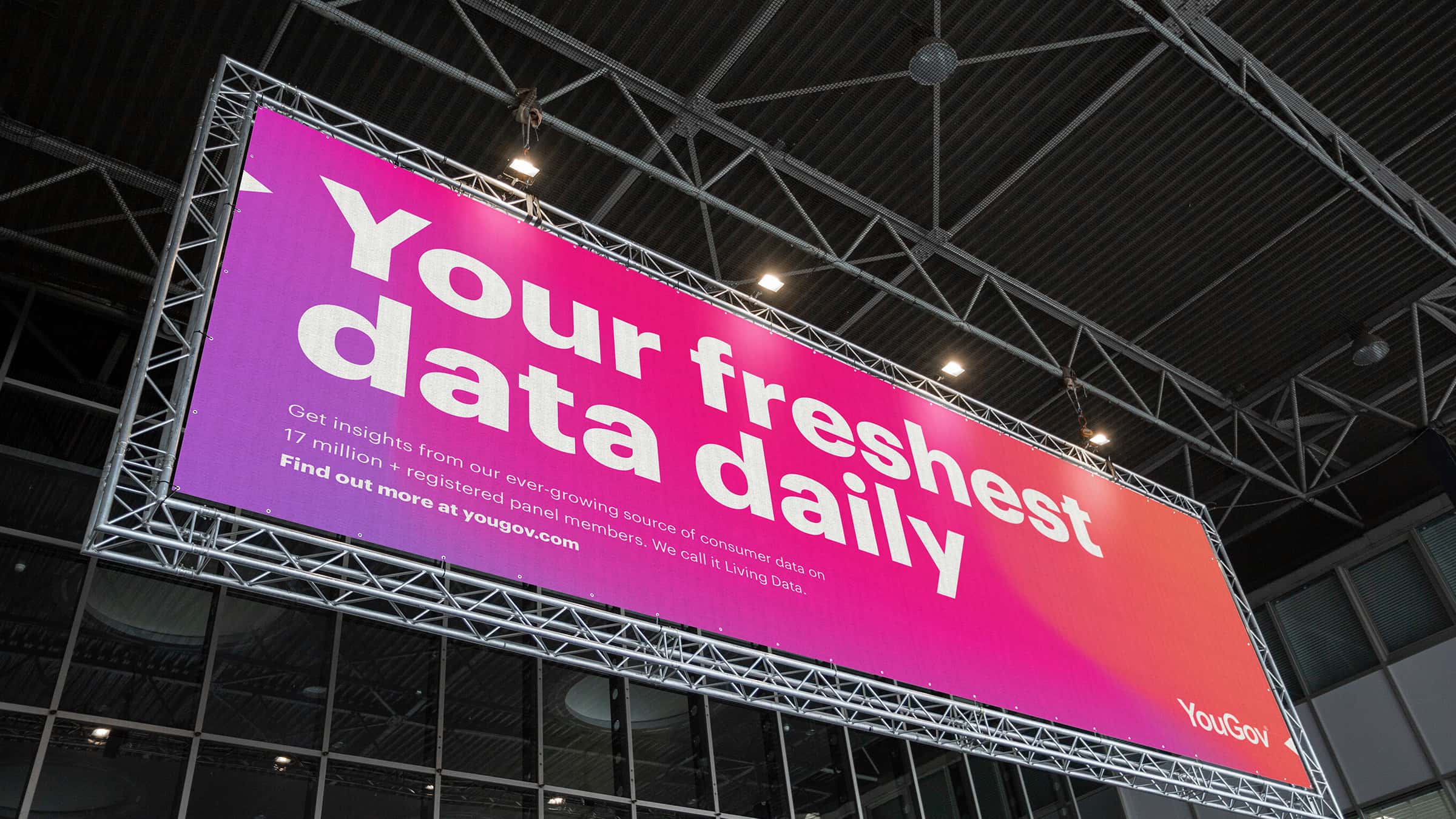
They have been building an ever-growing data source over the last twenty years built upon 17million+ registered panellists being asked over 40million surveys a year – creating the richest and most complete understanding of consumers’ complex lives.
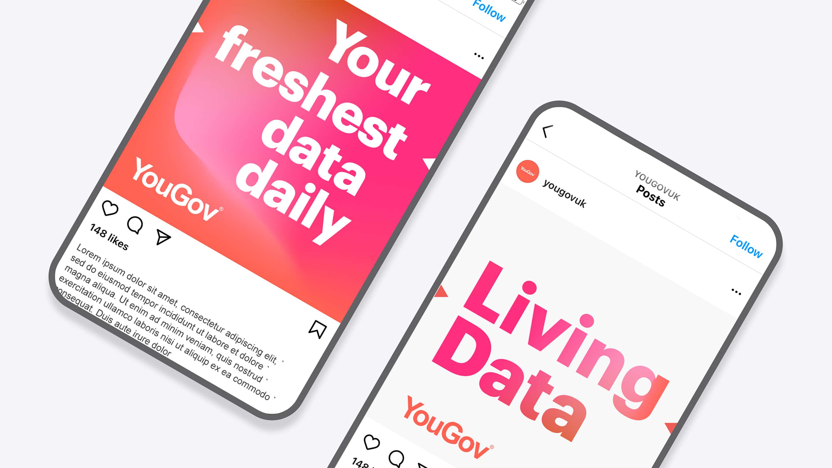
We repositioned this as “Living Data”.
Clients get access to this “Living Data” through YouGov’s platform and range of products, getting a snapshot of what people are thinking right now, not in six weeks, once the commissioned research report is returned.
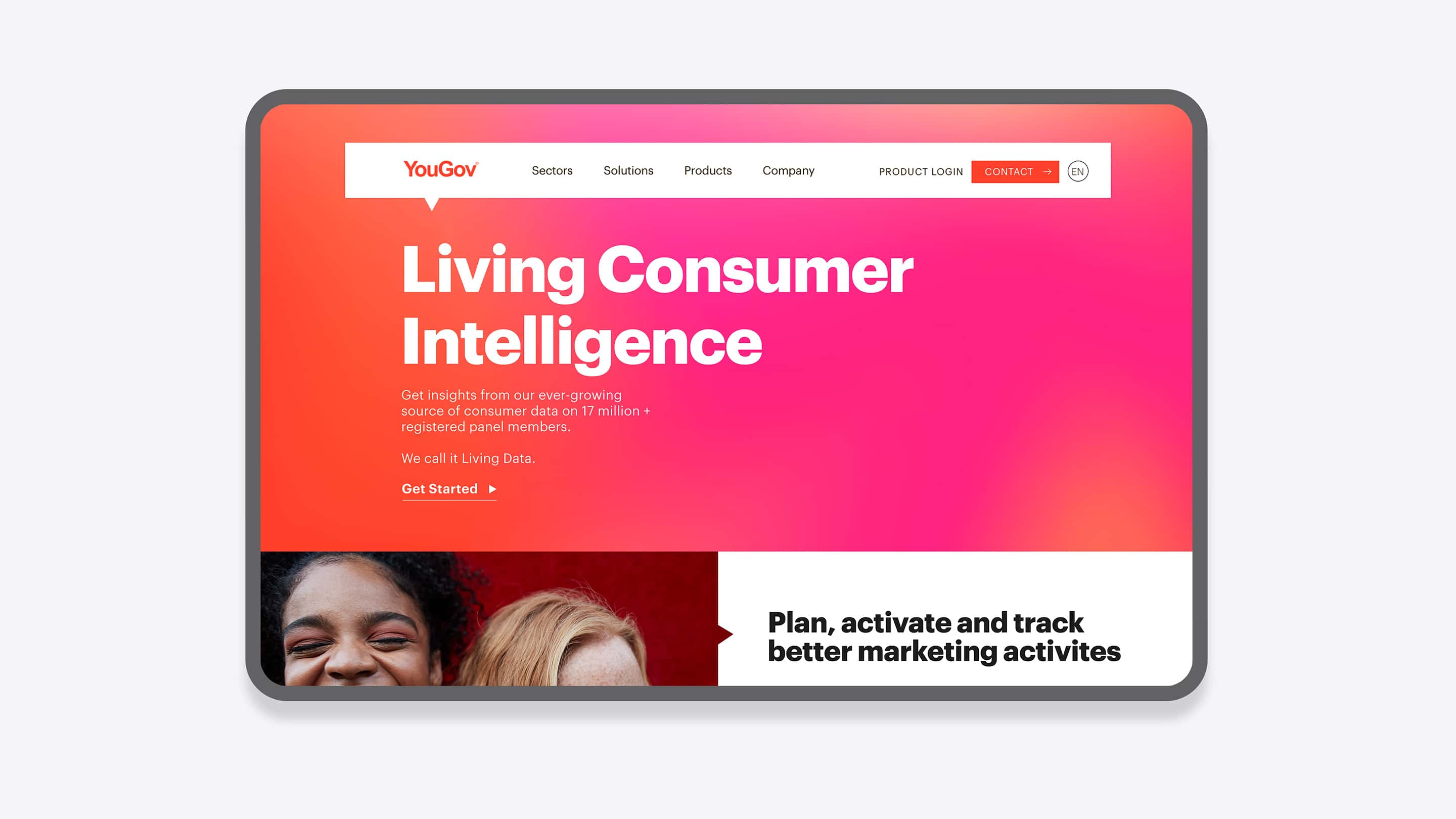
We used this understanding to create their new value proposition “Living Consumer Intelligence”.
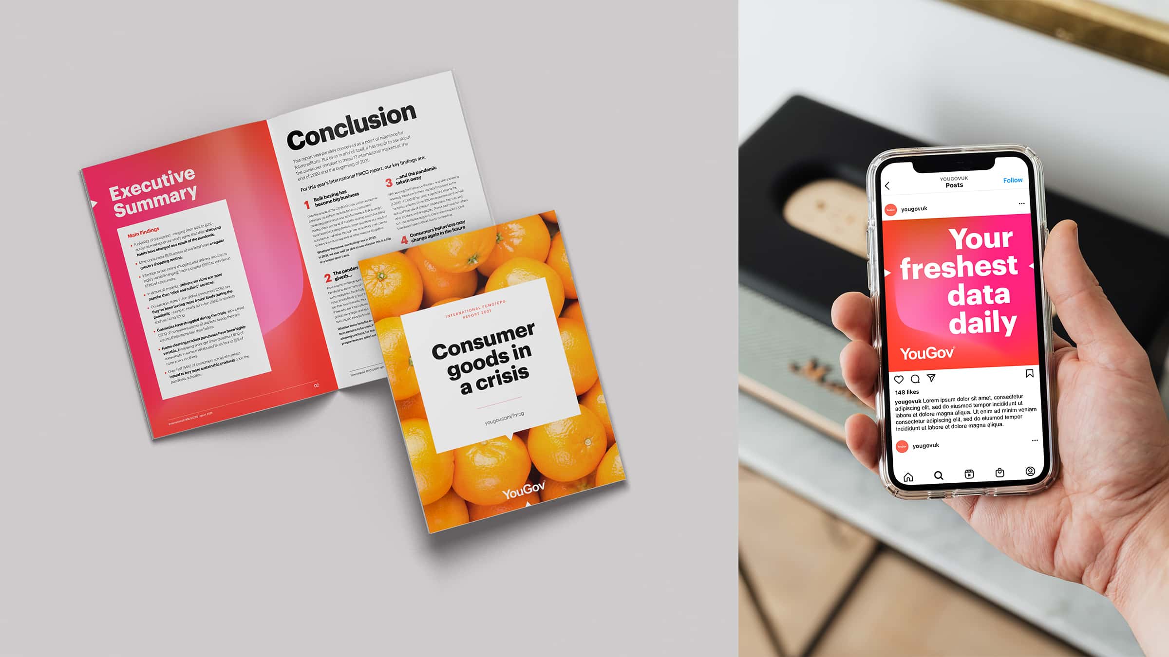
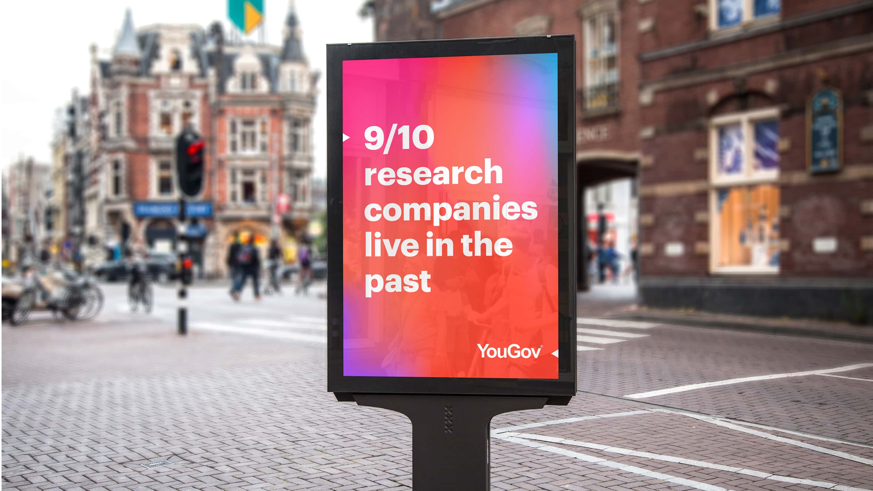
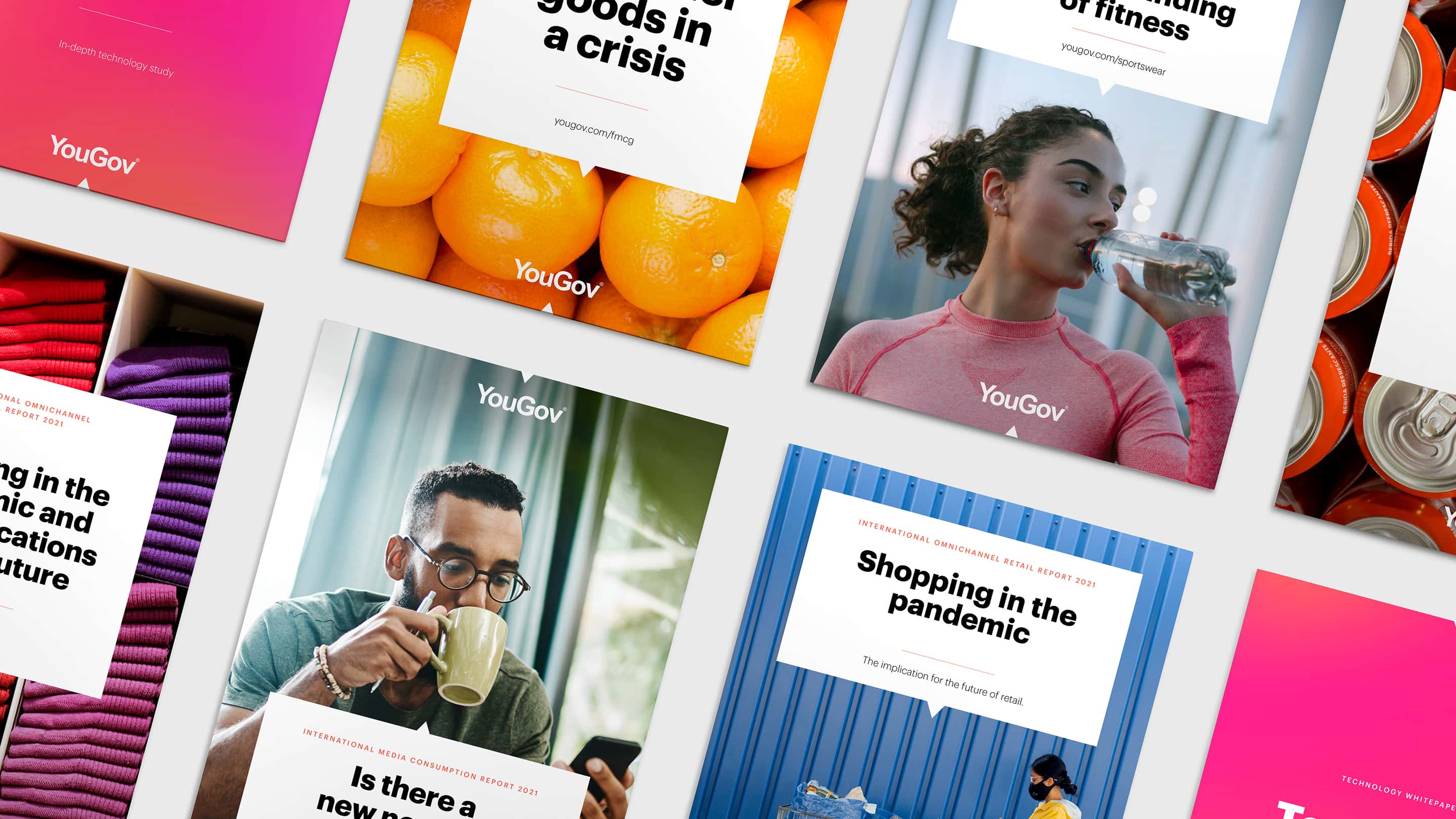
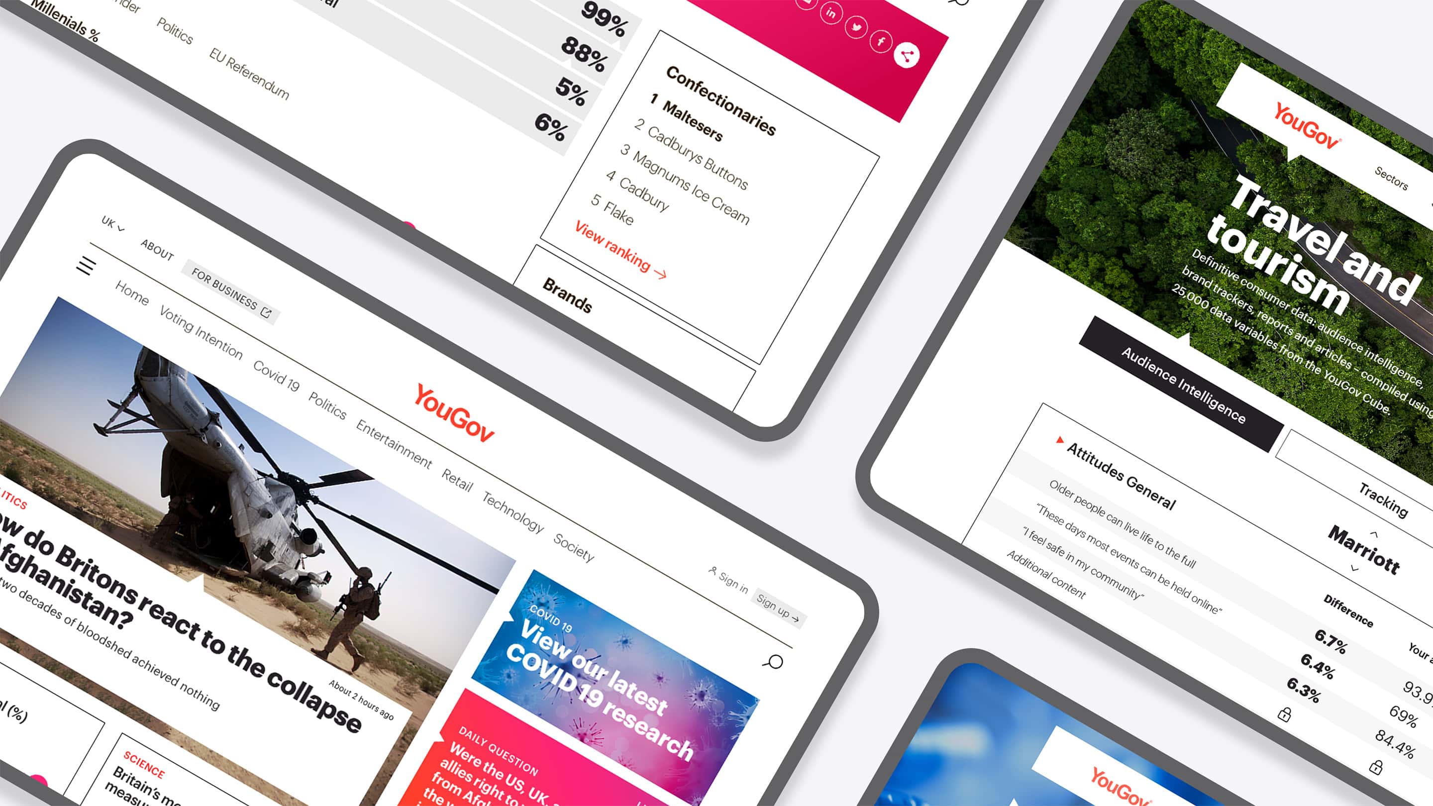
We reflected this idea with a vibrant visual identity. We added a range of animated flowing gradient backgrounds, built around their core ownable Grapefruit colour which represented the flowing, living nature of their data. We also combined it with natural image textures and a new kind of pointer device that reflected the immediacy of their data.
On top of that, we layered on a confident and engaging tone of voice that complimented the design and made the words pop off the screen.
Where we've made the difference
See how we've created compelling, digital-first B2B brands
Cohesity
Cohesity; a vibrant world for cybersecurity
To claim Cohesity’s combined status as the new #1 in AI-powered data security, they needed a full rebrand and a launch that would make an impression.

Nutanix
Setting sail from a sea of sameness
Erstwhile challenger brand, now established cloud technology player, Nutanix, saw a chance to grab market share through a new brand identity.